How Correlated is City and Highway Fuel Economy in Modern Vehicles?
Harris Kittner
See full version
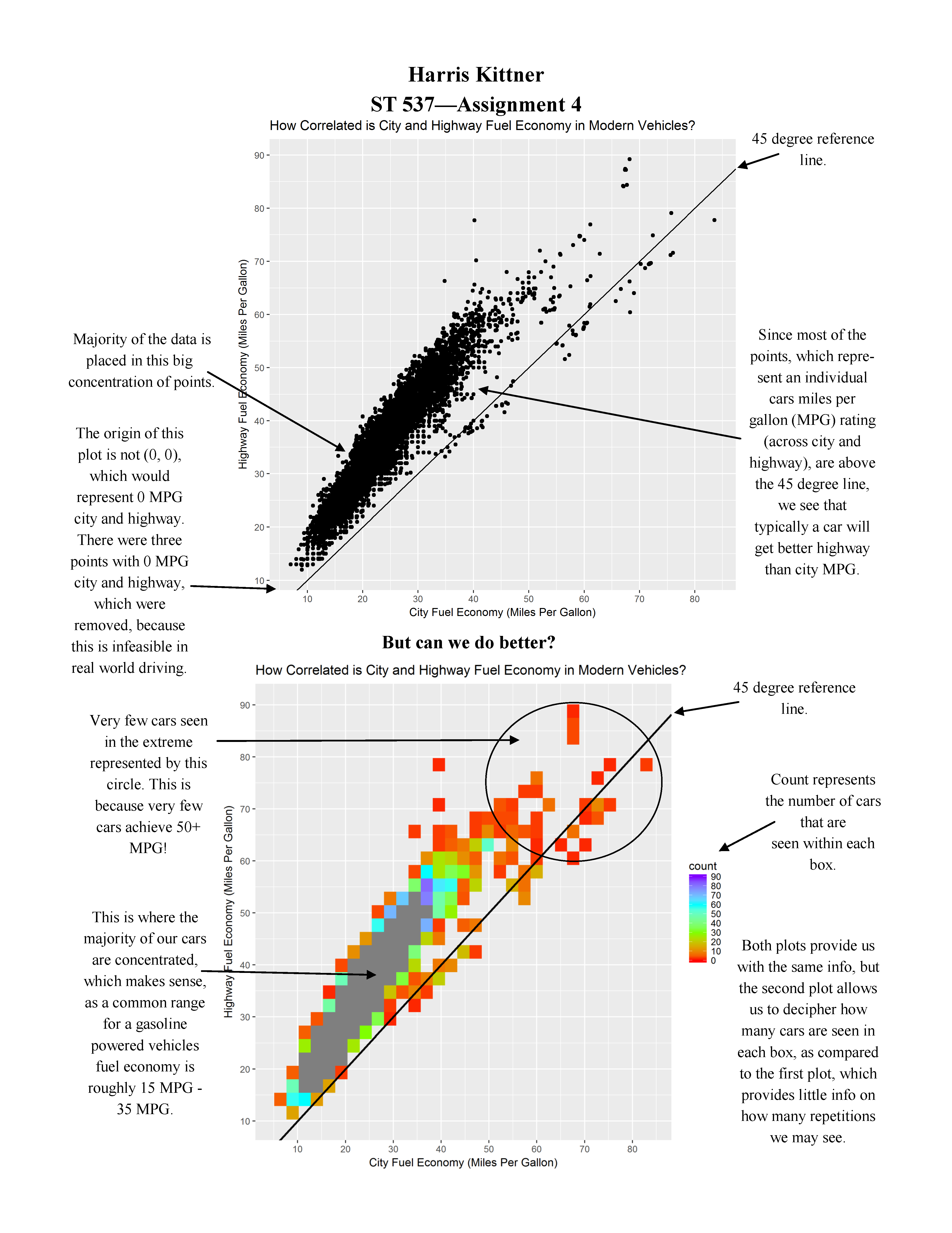
The following plots show two different depictions of the same data. The first simply shows all of the possible miles per gallon (MPG) combinations between city and highway MPG in modern vehicles, with a 45 degree reference line. The second is much more colorful, featuring boxes whose color depicts the count of how many vehicles are represented within that square, plus the 45 degree reference line.
Both plots represent the exact same data, but we get so much more out of the second plot, showing us the extreme power that visualization can have on our data.